
Get more insights by following me on Linkedin abubakriqbal1
How These 3 Elements Transform Your SaaS Product Design into an Enterprise-Grade Platform.
Over 5+ years of experience as a Product Designer i have learned that the following 3 things can change the look, feel and UX/UI experience of your product whether it is an MVP, B2B, or B2C application.
Branding
Spacing and Padding
Atomic Components
Important Things to Cover In Branding
1) Logo
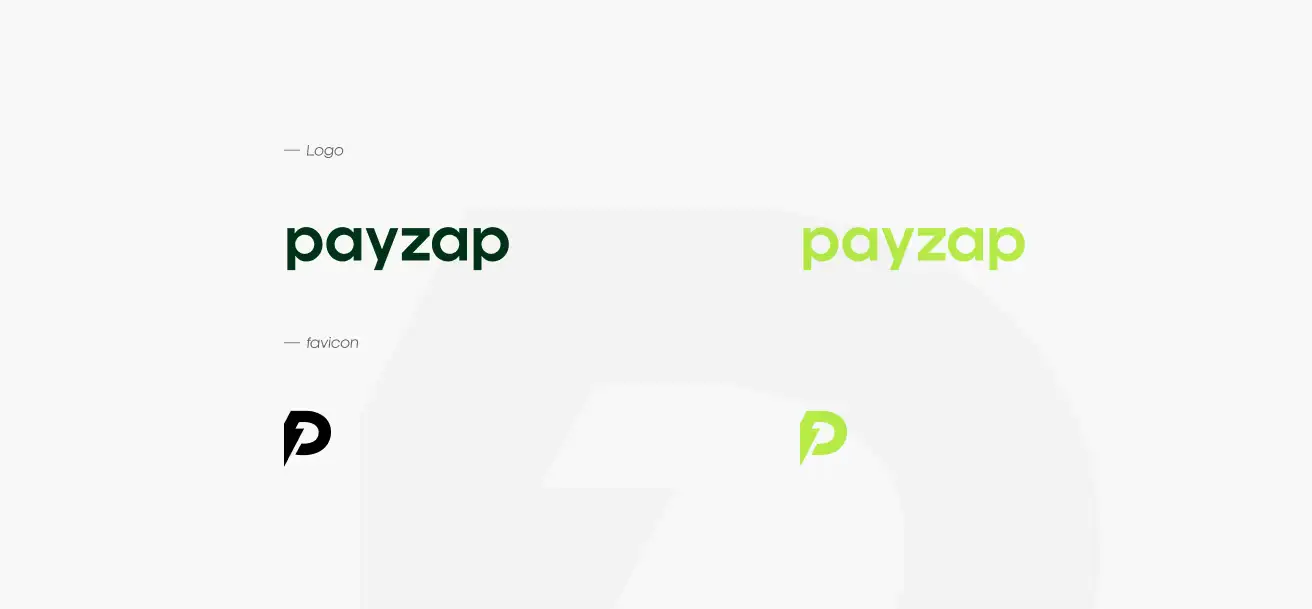
Create 2 versions.
One complete logo in the primary colour and one version for dark mode.
A favicon of size 48 x 48 px for Google Search and for other related uses.
2) Typography (font-selection)
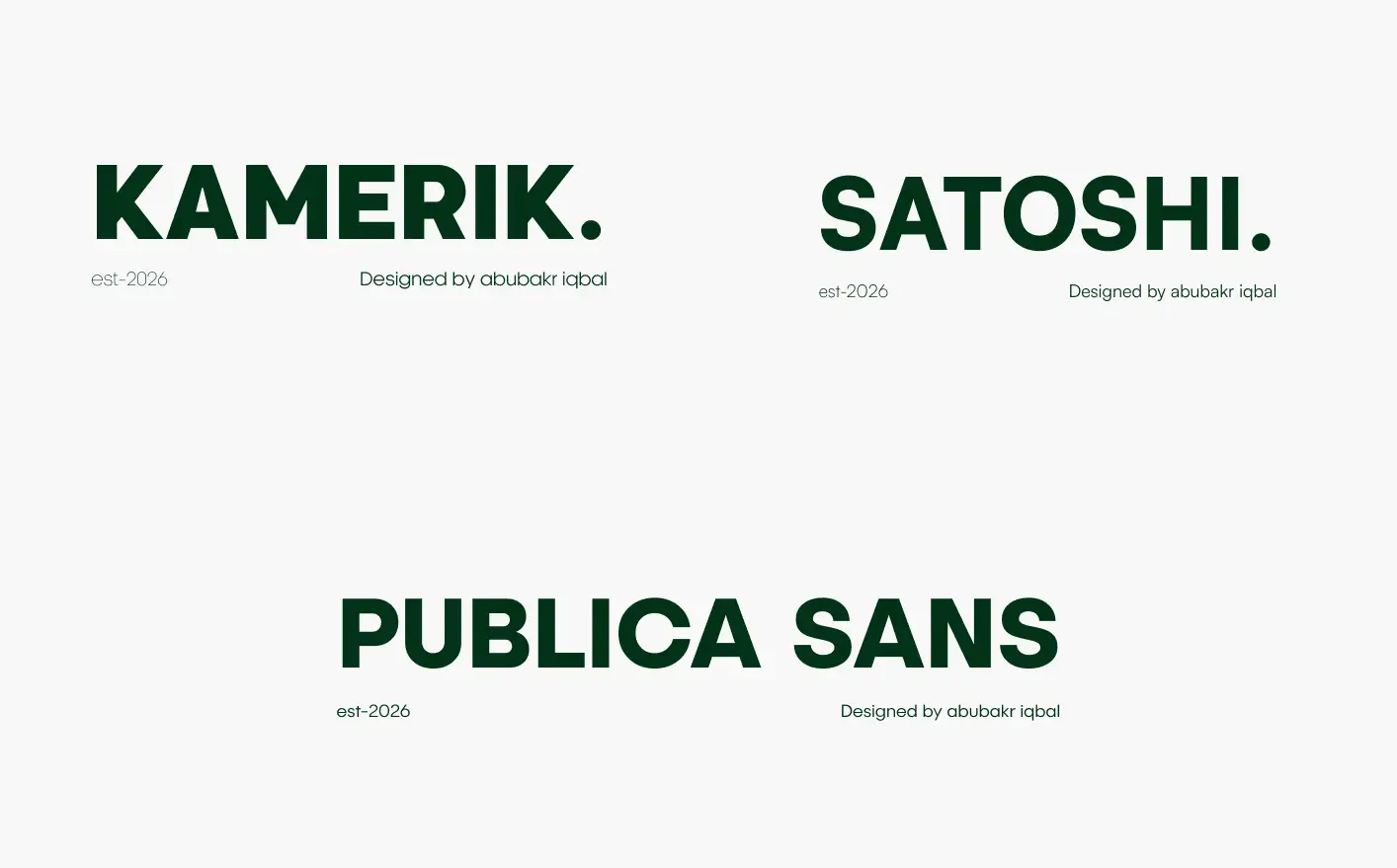
Select a font that suits the market type you are releasing your product in. Tip #1: Use competitor-tested font style. Take a screenshot and share it with any AI tool
Tip #2: Select a font that has multiple weights like (Regular, Medium, Bold, Italic) because you will find some good fonts but their font weight library may be incomplete or maybe you have to pay.
Fonts that are tried and tested by me and used in enterprise level products and SaaS UI design are Kamerik, Satoshi and Publica Saans.
I used Satoshi to design one of my MVP fintech product Payzap.
3) Colour Selection
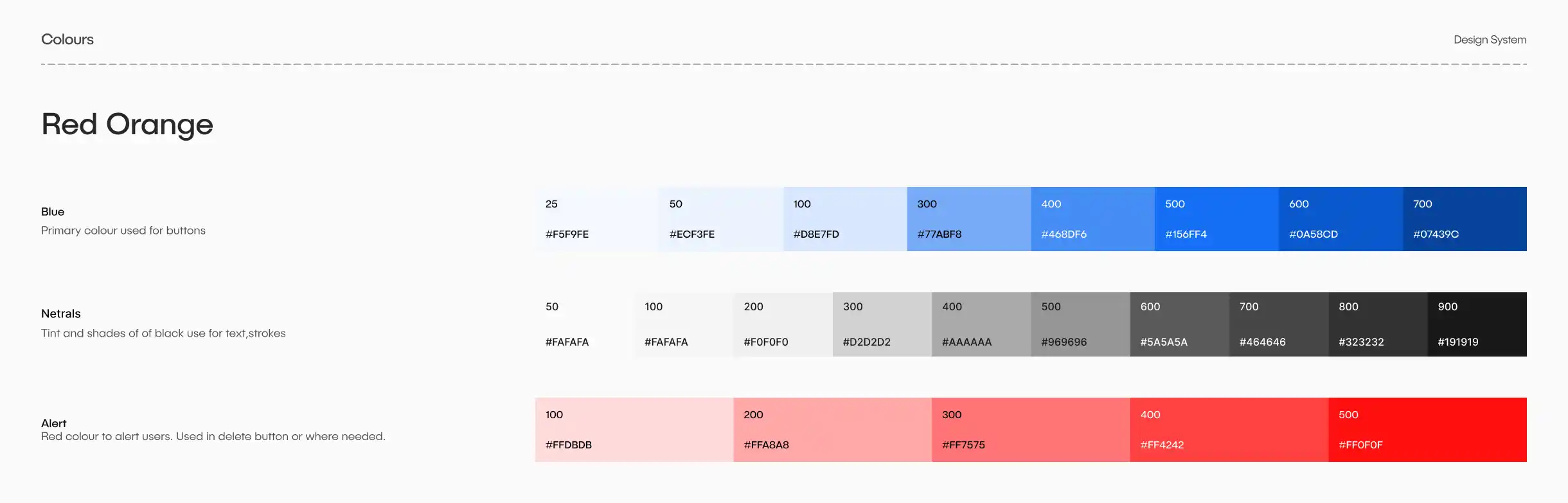
Pick a primary colour. Tip #1: Inspect any colour you like on a website like Drbbble, Pinterest or enterprise apps. Right-click on the website and click inspect. Use a colour picker and grab the RGB or HEX values to use a similar colour for your product.
Create a few tints and shades of primary colour, neutral, alert colors. Use AI or colour shade generator available online to speed up this process.
Check out my Diamond Kit as well! It has a solid colour scheme you can plug into your MVPs or smaller projects, and it's great if you're looking to give an existing design a fresh look.
How Spacing and Padding Creates a Difference
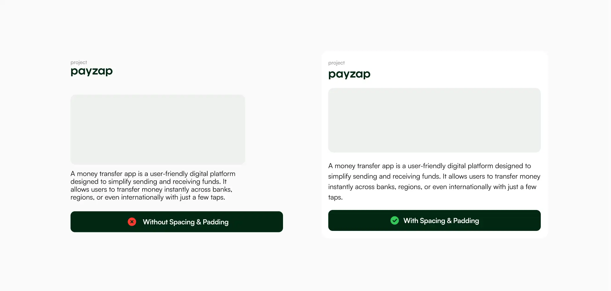
Improves readability
Padding gives content breathing room, making text and elements easier to read.
Without padding
Text touches edges
Feels cramped
Harder to scan
With padding
Clear margins around content
Better visual comfort
Faster reading
Makes Design Feel Premium
Improves Touch & Click Usability
Example:
Card with 0px padding → cluttered
Card with 16–24px padding → clean
Spacing and padding are design game-changers. When designing molecular-or atomic-level design system components use appropriate spacing and padding guidelines. Material UI a great example for implementation.
The Leanest Component Library You Need for Your Next MVP Design
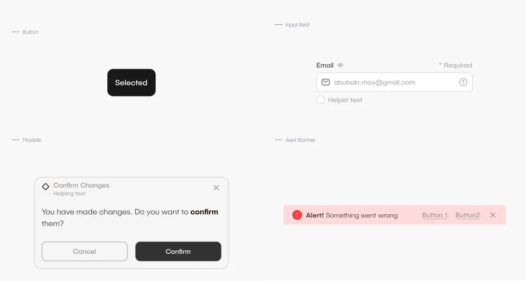
Buttons
Input Field
Modals
Alert Banner
If properly applied spacing, padding, and typography rules creating these components will be enough to have an amazing enterprise-grade product that stand out in the market and has a unique identity.
